
Mobile UI/UX Design | Branding | Client Work
Role
Team
Tools
UI/UX Designer
1 Design Lead, 4 Designers
Figma, Adobe
About
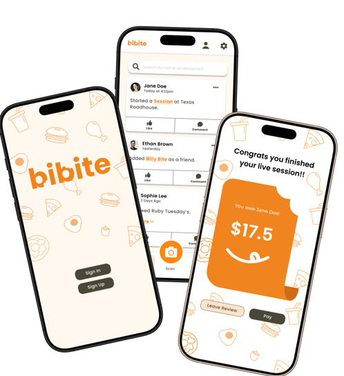
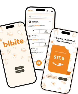
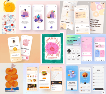
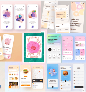
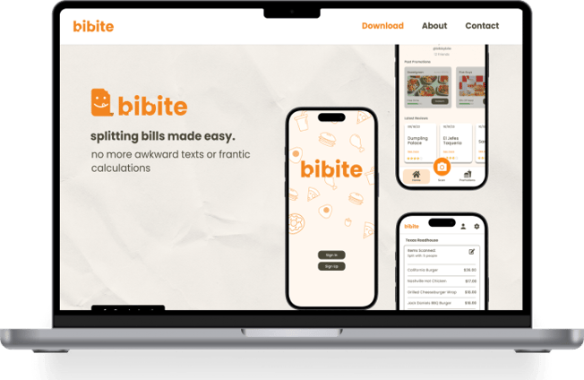
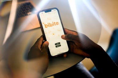
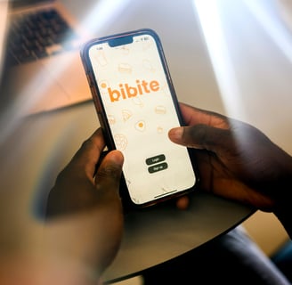
Bibite is a receipt scanner app that takes the hassle out of bill-splitting!
The app will enable users to scan receipts, automatically create an itemized list, and instantaneously generates customized payment through Venmo, simplifying the expense-splitting process.
Making processes quick and enjoyable!

Context
Bibite started as a simple coding project from three developers who wanted to create a real, impactful app. They came to Scout Playground for a quick turn around to develop designs for their idea.
Deliverables:
name (we didn't start as Bibite!)
design system
logo
hi-fidelity prototype


our client
our team
Problem Space
Splitting bills at restaurants with friends can be a hassle. Often, it consists of individually doing math and then Venmo-ing amounts of money to each other, hoping they add up to whoever braved the bill.
Our client wanted to solve this problem and make the space more efficient, accurate, and fun.
Consumer Painpoint
Client Painpoint
Our client was struggling to find a way to make revenue from the application AND incentivize users to start using their application.
We knew a new user experience crafted to suit these dual needs was necessary.

Solution
Build an app that streamlines the bill splitting process and partner with restaurants to provide promotions to users
This solution would simultaneously bring more foot traffic to partnered restaurants, incentivize users to use the app, and bring money to our client.
Our app was now better aligned with both user and business needs.


Research
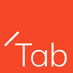
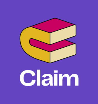
We began by researching competitors like Tab, Claim, and Splitwise and focused on any similarities with our features, how they built trust with their users, and any gaps we could fill.


Built-in tax and tip calculator
Not very streamlined (must take picture, no scanning)
No community aspect
Strong brand identity, encourages community of friends to save $ and try new businesses
Fails to gain complete trust of users
No scanning component → Request reimbursement (delays)
Group transparency, can see how much everyone owes
Premium features locked behind paywall
Key Insight:
Bibite should encourage community, be streamlined, and promote group transparency
Branding
Redefining the application meant redefining its brand identity. We started with branding as it would give us a clearer concept on what to work toward.
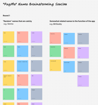
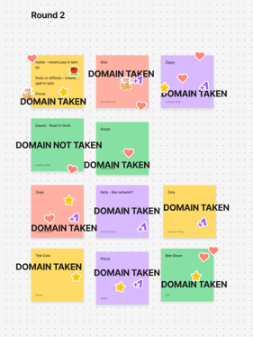
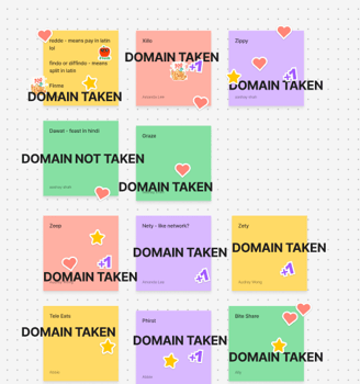
Tasked with coming up with a new name to replace PayMe, we had a powerful brainstorming session in Figma.
Coming up with a new name
There were three important aspects to keep in mind based on the client's wants. It had to be a name that was:
Random but catchy like Venmo.
Related to the app's function in some way e.g. receipt, dining, bill splitting.
New & not a taken domain on the internet
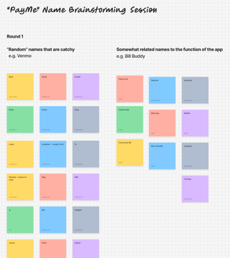
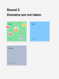
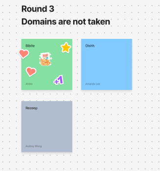

We eventually decided on the name Bibite (bih-bite) which is a play on the words "bill" and "bite." It also means "drinks" in Italian!
Design Direction
Next, to help us coming up with a direction for a design strategy, we individually created moodboards. We then came together to combine our 5 moodboards into 3 that each had a defined direction.
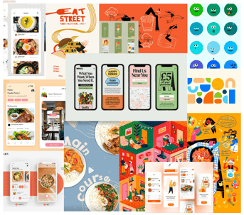
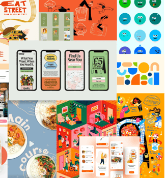
Community, warm, welcoming
Somewhere in the middle
Trustworthy, reliable, tech-y
*WINNER*
Logo & Design Identity
We brought our warmly refreshing brand to life as we developed our Design Strategy. To balance both the warm aspect and the refreshing aspect, we created illustrations in Figma but also kept all elements minimal and simple (no gradients, consistency etc).
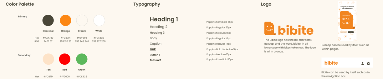
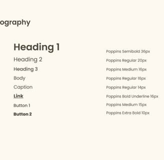
We heavily used orange as it entices appetite and is very friendly.
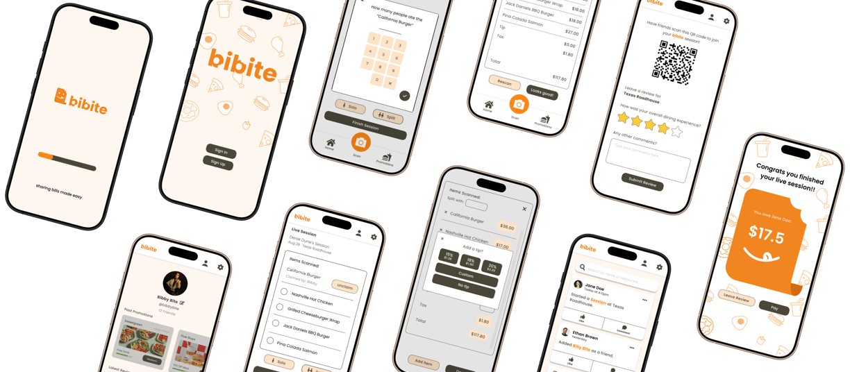
Wireframes & Workflows
Our design lead delegated workflows for each designer to tackle. I took on the onboarding & user profile.
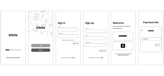
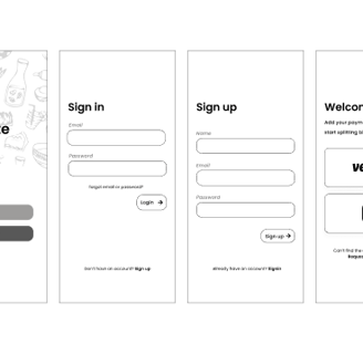
The onboarding flow was kept short and minimal.
Rationale:
1) Short → Lower barriers to entry so more users can start using our app
2) Minimal → Establish trust by utilizing design choices similar to other financial applications
Onboarding
I created my first iteration(s) of the user profile based on the user flow provided by our client.
User Profile
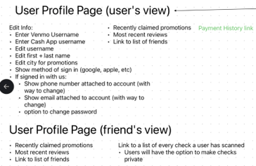
Making iterations & asking for feedback is a vital part of my design process.
Several revisions were needed from the first iteration of the user profile.
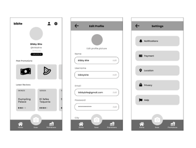
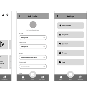
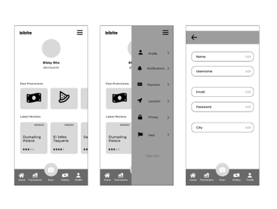
Final Iteration
By iterating on the user profile, my design changes optimized accessibility & modernity.
Rationale:
1) Accessibility → A hamburger menu is not as intuitive nor easy to navigate- especially on a mobile interface
2) Modernity→ Most applications have abolished the use of hamburger / split-screen menus as full-screen flows are more intuitive for users
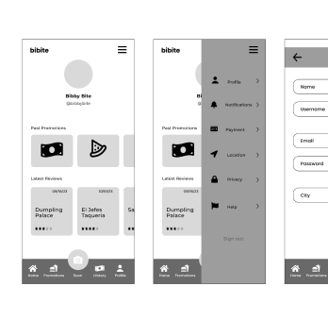
First Iteration
I love getting feedback for my designs but I also love giving feedback. Here are some
key design changes I contributed to:
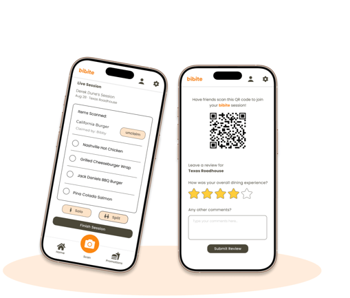
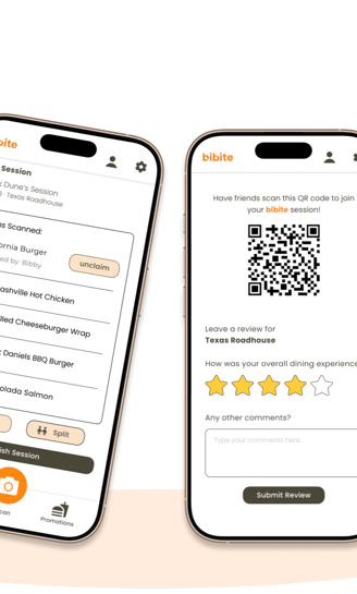
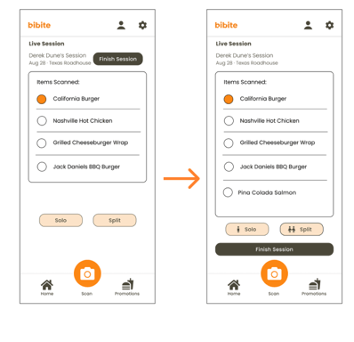
Splitting an item flow:
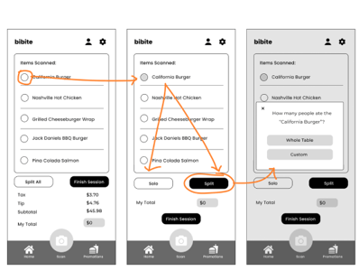
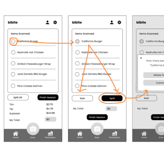
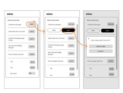
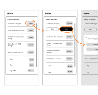
Previously:
Too many clicks & repetitive actions led to confusion and decision fatigue
Final:
More streamlined & efficient
Communicates to users where they are
Tip Feature
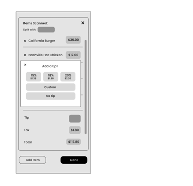
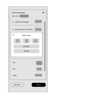
Key design changes:
Replicated from what users are familiar with
Pop-up window prevents taking users out of current workflow
Simple
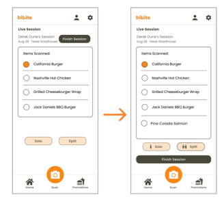
Key design changes:
Moved “Finish Session” button to bottom for better composition + elongated to stand out
Added familiar icons to solo & split to differentiate uses
Button Hierarchy
Final Product
Making splitting bills at restaurants with friends easier!
Visit the website: https://bibite.app/
Watch the prototype here
Reflection
Collaborating with 4 other designers can get tricky when it comes to staying consistent with text (sizes, thicknesses, leading), grids, and alignment.
Creating an internal design system within Figma helped with this problem tremendously, as well as just communicating during meetings.
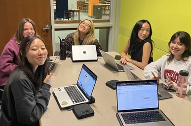
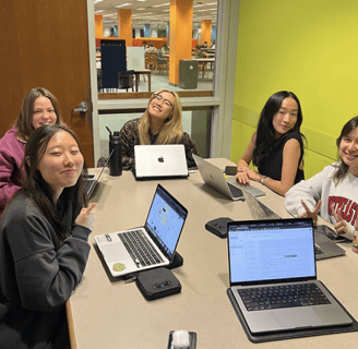
The Team
Main Takeaways
What's next?
In future team projects, I hope to engage with the same level of enthusiasm and iterative design processes to create more novel products & experiences. The team was ultra-collaborative and that is exactly what I love.
Bibite has a bright future! The developers are developing the app as we speak & gaining traction through marketing!
Check out this article Northeastern wrote about us!