Menufy
UI/UX App Design Passion Project
Software: Figma, Canva
Team:
1 Designer


About:
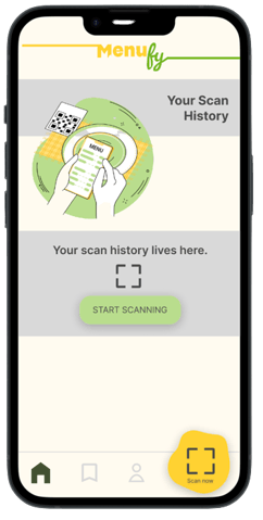
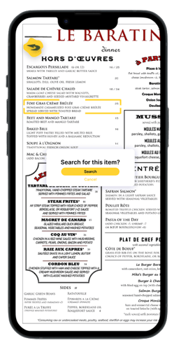
Menufy is the indecisive foodie's best friend. The app simplifies your choices by letting you effortlessly browse through menus and search the web for reviews and images with just a simple scan.
The Unconventional Journey:
My approach to designing Menufy was far from linear. In fact, my idea for this app started in a completely different direction- one involving AR and 3D rendering. And even a different name.
As my first ever UI/UX design project, I learned IMMENSELY between my first and second design cycles. Here's a glimpse into my process:
Jan 2023
Ideation
My friend approached me with an idea for a mobile food app:
imagine if you can scan food items off of menus and have them pop up as 3D renderings, almost like Pokemon Go characters! This would be a fun way to envision your food before ordering, and almost gamify the boring waiting period after ordering your food.
Feb 2023
First Design Cycle "Hi-Fis"
The idea was supposed to stay exactly as it was- just an idea.
But I really saw the value that this app could bring.
So I got to designing:


The Redesign Process :・゚✧:・゚✧
August 2023
After gaining experience from other design projects, the flaws in my approach to designing "Picture Your Food" really stuck out to me.
Although I was still fond of the concept: an app that helps diners with decision-making, there were many holes in the idea.
With my additional experience and newfound knowledge, I decided to revisit the project, this time, designing with a more structured UX approach.
Stage 1
Ideation & Contextual Inquiry
I identified the problems I was trying to solve and the solution the app would provide. Sketches were a big help during this stage.


Stage 2
Competition Research
I analyzed food apps that utilized scanning functions. Most apps were marketed as health & fitness apps, and primarily used to track calories or identify allergens. There was no app on the market that tackled the problem of food indecisiveness.


Stage 3
Branding Design
Keeping competitor research, design principles, and my intended brand messaging in mind, I created several iterations of the logo, color scheme, and complimentary design assets.


Stage 4
Low Fidelity Wireframes
Using my sketches, branding, & previous mockup for inspiration, I created low-fidelity wireframes to map out the most important user flows and gain a basic understanding of how the user might interact with the application.


Stage 5
Hi Fis & Prototyping
Fully incorporated Branding → Created components → Iterated on designs based on user feedback → Final screens → Prototyping


Takeaways
My biggest takeaway from this project was the importance of intensive iteration and reflecting on design decisions. No matter how confident I might have been about using a certain logo, color palette, or screen layout, I would always create different versions or modify elements as I designed. Having multiple variations of the same screens or design assets, made interpreting the functionality and application of different design decisions easier, and also made the job of my critiquers (non-design thinkers), easier to navigate.
In this project, I went through several iterations of the:
User tasks & flows
Logo
Color scheme
Design assets
Screen layouts & features
I also learned for the first time:
How to use components
How to use autolayout
How to prototype
Looking Ahead
I definitely classify this project as a work in progress. As I continue to work on this app, I hope to design a software wizard that guides users through instructions on how to use the app. This way, all the functions of Menufy are made known to the user, and they can get the most out of their experience.
I had a LOT of fun with this project and I hold it really near and dear to my heart because it continuously teaches me SO much. From it being my very first UI/UX project to it now being my latest.
